Fusiion
Even amidst the global pandemic, dining out to eat never came to a stop.
I designed Fusiion for the millions of Millennials that identify as “foodies”. This project was created academically as a Capstone assignment. Dig into our foodie journey below.
Fusiion centralizes the search for restaurants so that social foodies don’t have to go through the “time consuming” research process of finding food.
Cool, how did we get here?
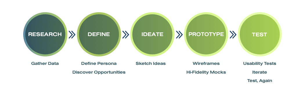
The Design Thinking Method

So what is the problem?
Well let me ask you this,
“Where do you want to eat today?”
That seems to be the question that Americans spend 132 hours a year trying to decide. Millennials happen to be at the heart of that issue, dining out at least 20% more than any other generation - so we decided to focus on them. It seems that they’re overwhelmed with what appears to be such a simple question.
Let’s understand why.

To understand and empathize with our users we relied on
We believed these research methods would provide us with the facts of what is presently happening in the foodie world along with real individualized insights from people.
We've learned that 40% of users will turn away from an app if they experience any difficulty finding food or placing an order. Not only that, According to research by Upserve, when Millennials search for restaurants, they’re looking for very specific factors:
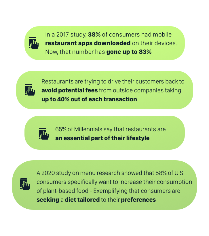
Continuing our research, we wanted to call out some interesting points within our quantitative data.
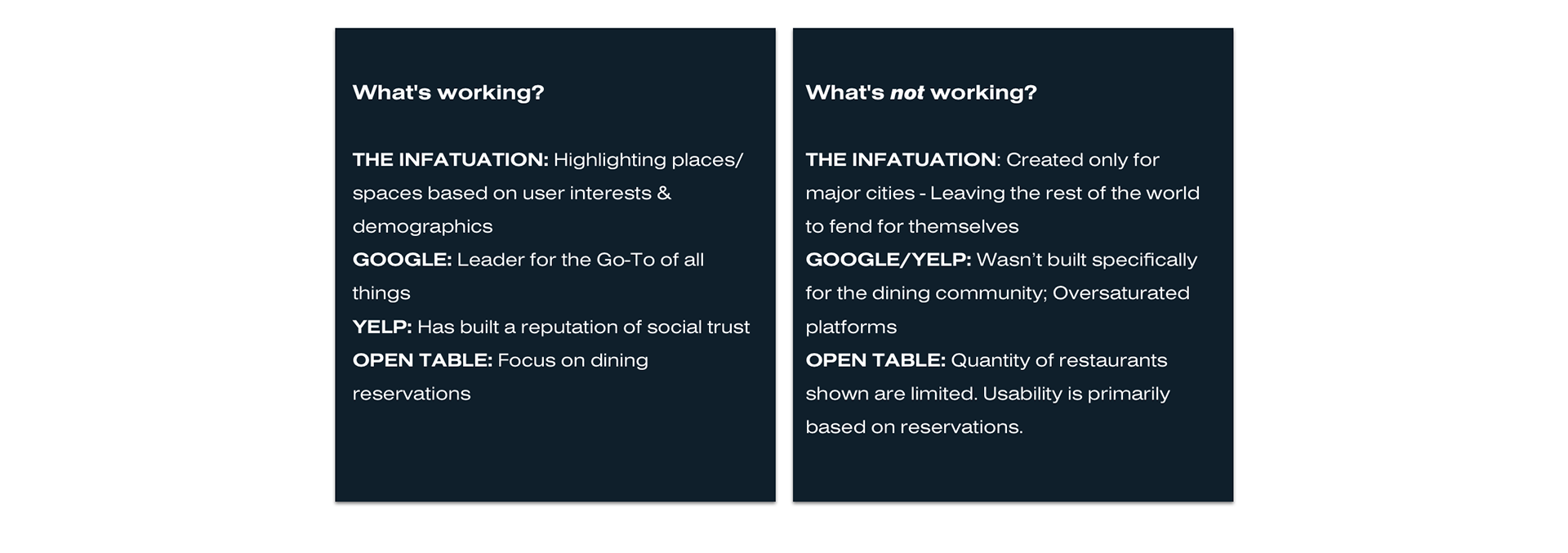
Next we went on to market research to explore what products people were currently using to find restaurants. Here's what we found:
Competitive Analysis
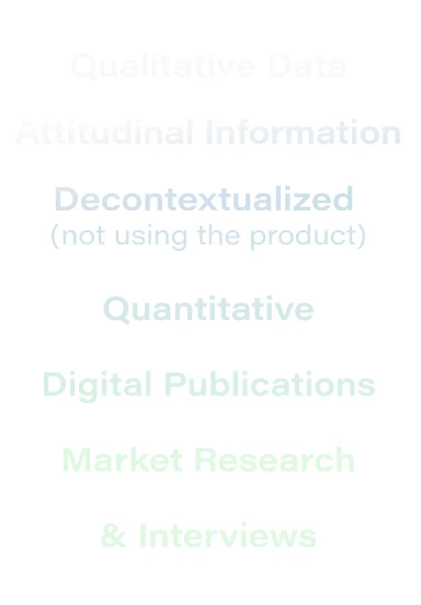
With this information, we confidently began creating our script to conduct user interviews. This allowed us to gather decontextualized and attitudinal insights from real people.
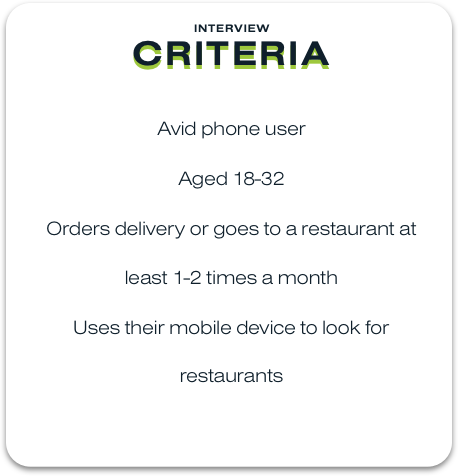
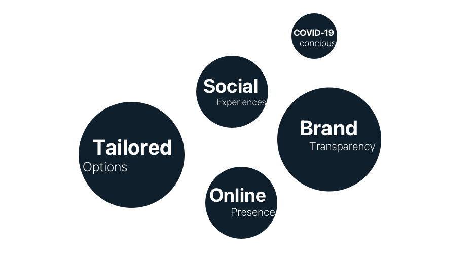
Using our criteria, we interviewed 15 participants enabling us to pull 3 key insights:
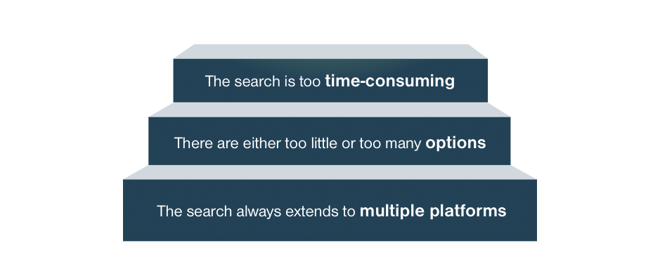
No one likes too many steps
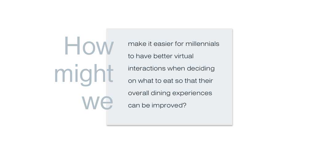
So we brainstormed on..

We pulled the information from our 15 interviewees to create our user persona. They were aged 21-30, loved dining out to eat, and used apps like Instagram and Google to find restaurants. However, each of them felt their current process was "Too Time-Consuming". We took this information combining it to develop our User P ersona.
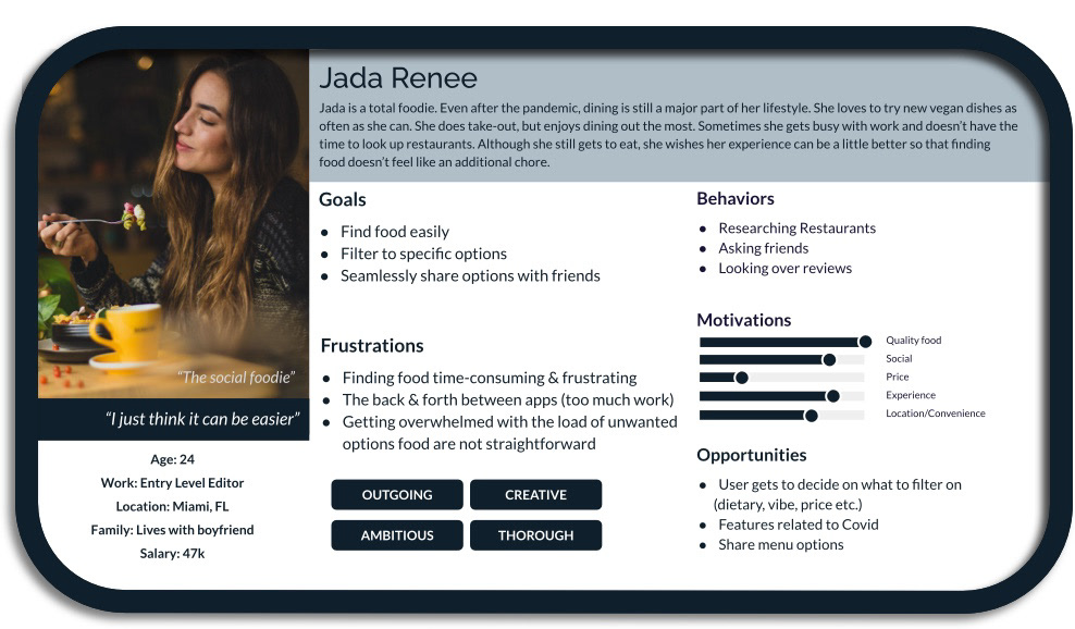
Meet Jada Renee
The 'social foodie' who recently more health conscious about her diet. She is a “Flexitarian” meaning that she eats a mostly vegetarian diet, but allows for meat in moderations.
See Jada's Experience map below
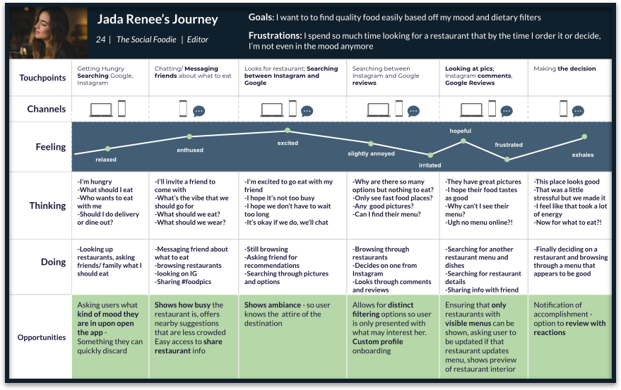
We started thinking of Jada’s journey in specifics and the thought process of trying to find a restaurant.
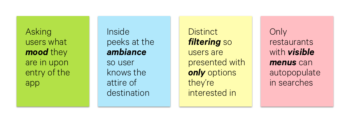
We found some interesting opportunities

Time to brainstorm
Now that we were able to consider specifics about Jada's experience and, we began to ideate and think of how we can develop solutions for her major needs, goals, and paint points within a digital product.
We started creating Epics with User Stories
We had 3 Epics that we wanted to incorporate for our friend Jada.
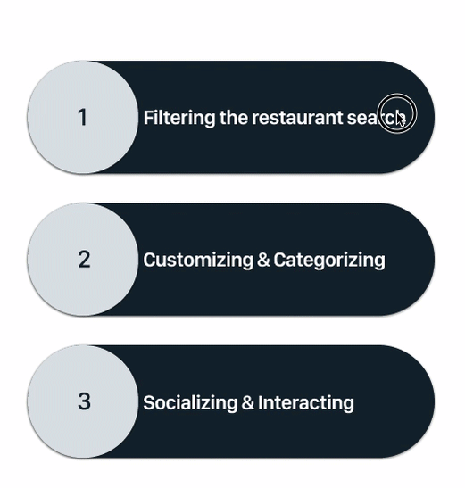
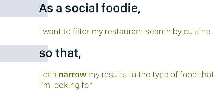
Our Primary user story was selected under the Filtering Epic
Primary User Story
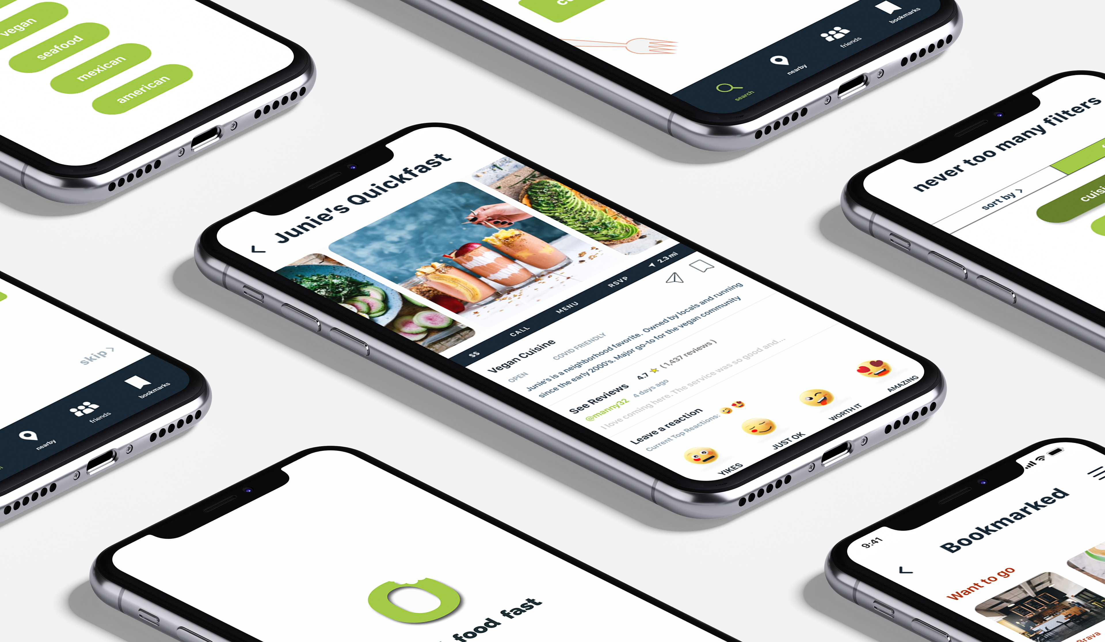
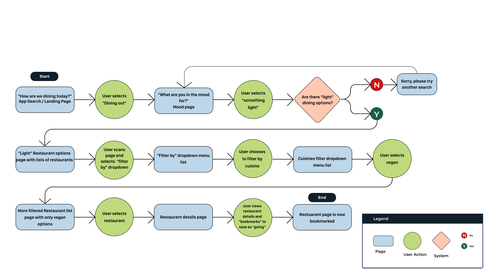
From there we developed a task flow beginning with Jada using the search feature for food, filtering and then ending with her finding a restaurant and saving it to her bookmarks.
Sketches
Once we felt confident within our Task Flow, we began creating sketches - exploring iconography and thinking of how we can visually prioritize the most important information.
The trickiest part of the sketching process was figuring out how to lay the information in a way that was simple, easy to understand and use.

Wireframing
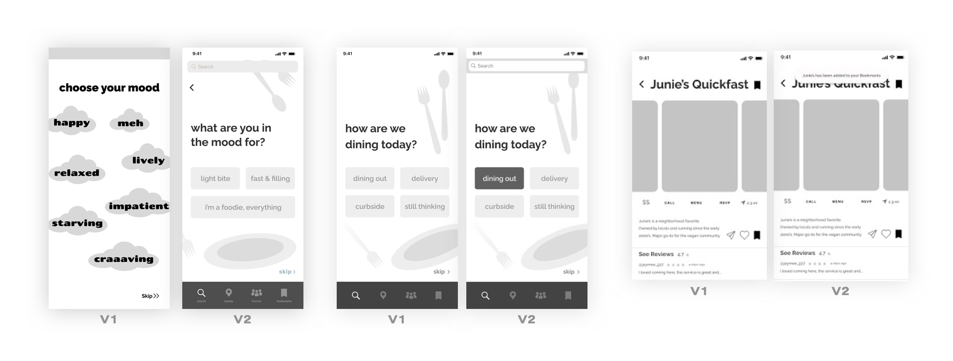
For the initial wireframe, we explored emphasizing the “mood” factor, but felt it was too ambiguous and tailored it to help the user choose instead.
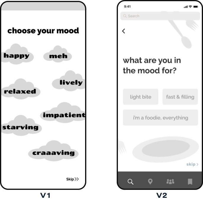
In V1, we felt that the moods would add to the user confusion rather than take away. So, we ideated and the design resolutions led us to V2; where we felt that having the user gauge how hungry they were, upon entering their food search, would guide them progressively further.

We created additional screens and began preparing the app to be tested.
We grabbed our Millennials and conducted
2 Rounds of User Testing
With 10 Participants
Here's what they said
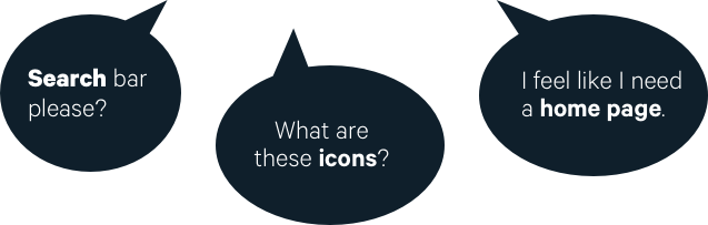

Leaving the Grey Behind
We made iterations according to our feedback. Once we began testing and users found the flow to be intuitive we felt comfortable to begin creating our Visual Identity
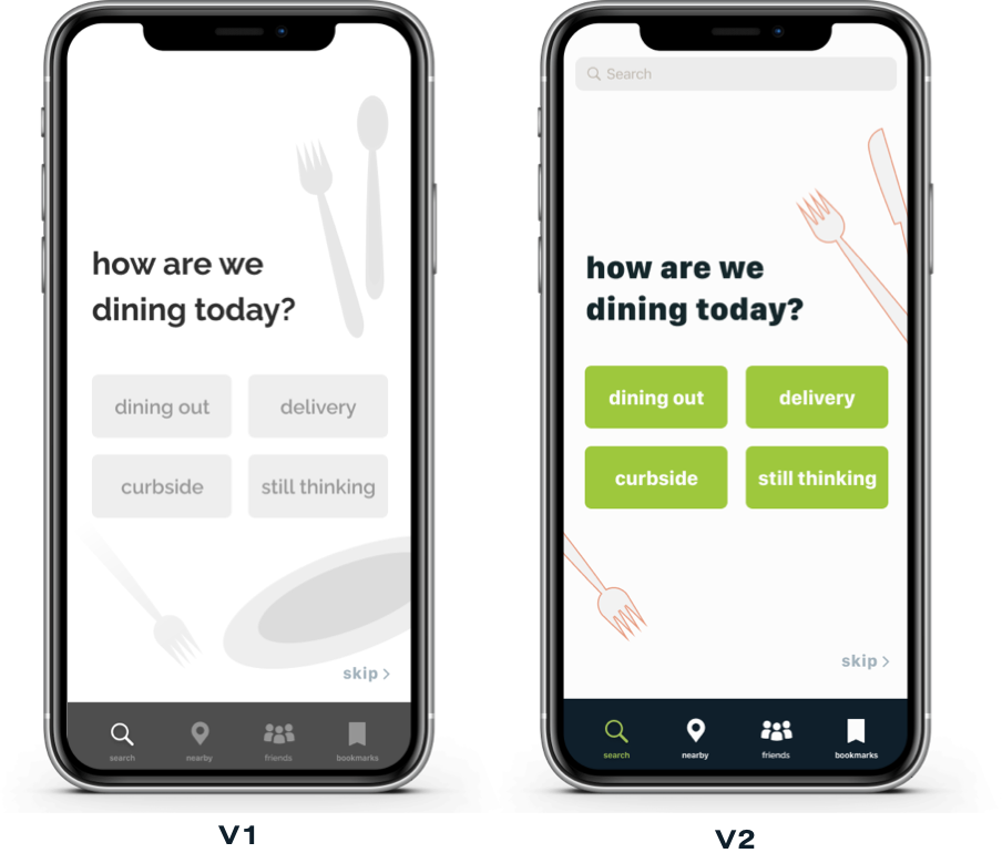

Building the Brand
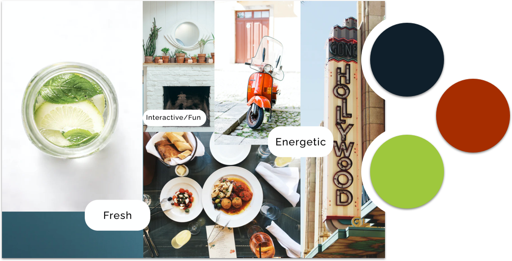
After several iterations on our prototype, it was time to develop the visual identity. We gathered inspiration for our moodboard with a focus on the feelings of ‘fresh’ 'energetic’ and ‘fun’. We began thinking of how we can convey those concepts into our own brand.
We created a moodboard where we were able to pick out our final brand colors
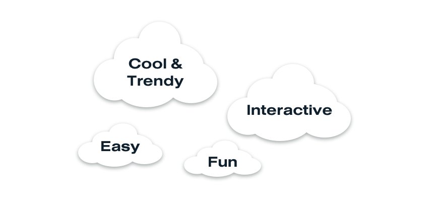
Starting our branding process involved us creating a list of adjectives that we wanted users to feel when they experienced our app. A few are in our cloud of thoughts below.
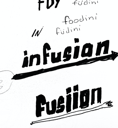
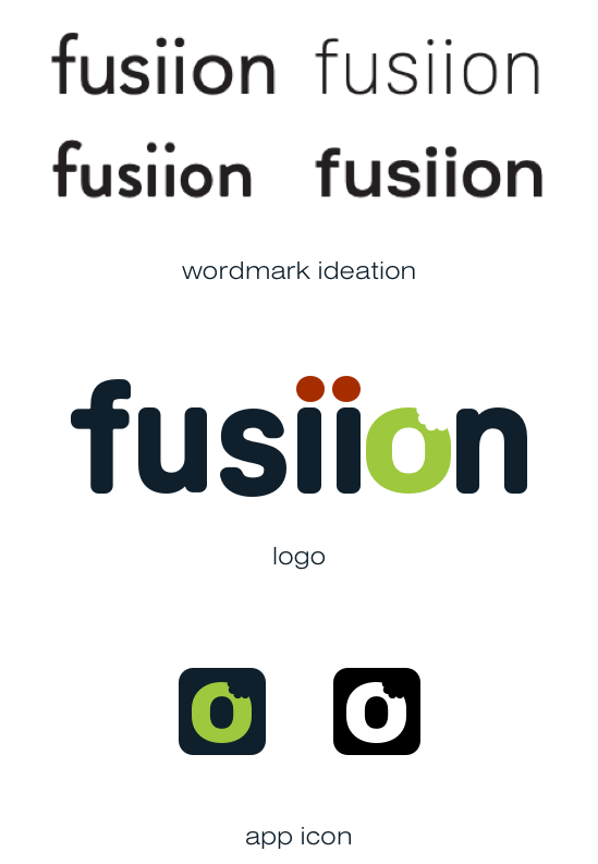
Brainstorming with various adjectives led us to thinking about how we aim to fuse food and fun within our app. We decided to go with fusiion.
We sketched our wordmark exploration along with various type weights in the chosen font.
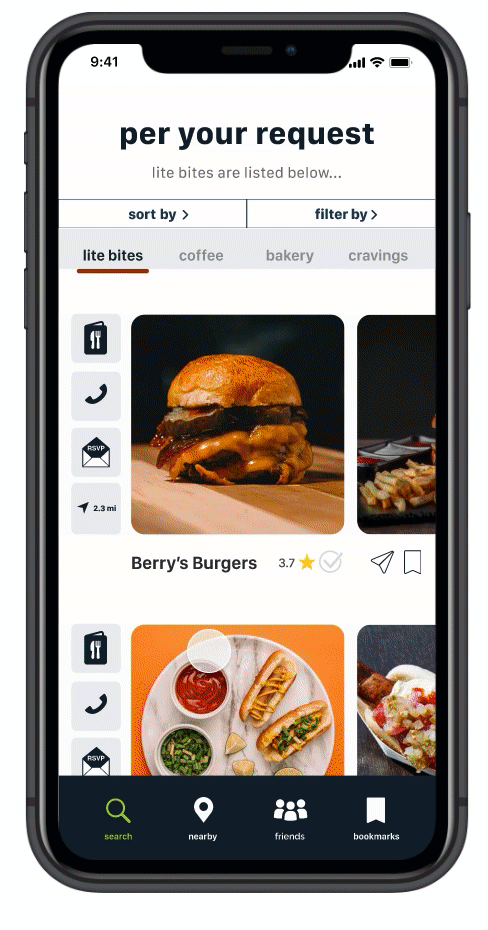
IMPLEMENTATION
It was finally time to implement our new brand colors and develop the high-fidelity design

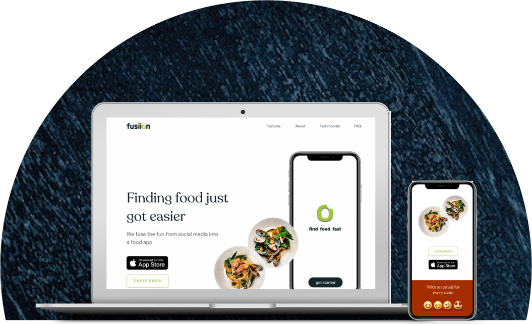
Promoting the Product
Once our brand and high-fidelity designs were developed we were able to create a marketing site to promote our new app for both desktop and mobile versions.

But of course, we couldn't leave it there...
We imagined the use of Fusiion on an Apple Watch. Thinking of what notifications or reminders would look like. We created a mock.
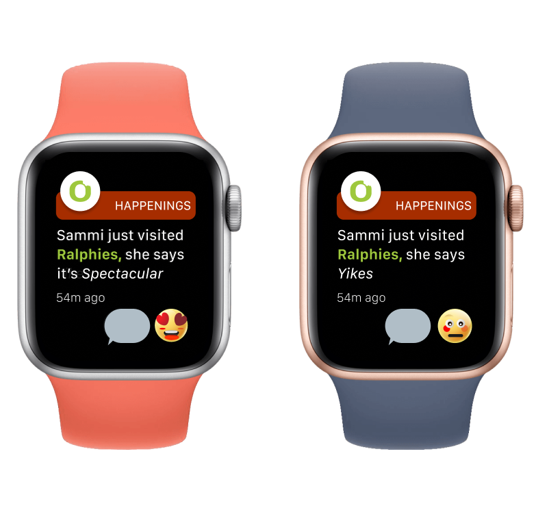
Our user Jada is getting a notification that her friend visited a restaurant called Ralphies, and now Jada can decide if she wants to take her chance to visit the Ralphies Restaurant
FINAL PROTOTYPE
Script Summary:
“Today you will be going out to eat. You’re vegan and you’re excited because it’s been a while. You’re not that hungry, but you are vegan, meaning that if necessary you may want to filter your options. You’re choosing a vegan restaurant with the best reviews and saving it so you can revisit in the future.
Tasks:
1. Filter restaurants by Vegan dishes
2. Decide on a restaurant with great ratings
3. Save restaurant to your “Definitely going bookmark”

My assumptions revolved around the idea that Millennials wanted a more personable experience when finding food so that they can connect directly with restaurants and cut out the "middle-man" use of third-party delivery apps. Although I don't completely negate this thought, I have come to validate that Millennials simply want to find suitable(by their standards) restaurants, in an amount of time that does not lead them to unnecessary frustrations.
We plan to expand on our user stories that will potentially lead to additional features throughout the app. We hope to TEST TEST TEST those screens and build out the prototype that way we can market the product to potential investors.
This has been an invigorating and tedious process that I have loved from beginning to end. I've learned how important it is to remove yourself and your personal preferences from the development of a product - a tricky but very important part of design.
Please connect with me on LinkedIn to learn more of Fusiion or even just to chat UX and Design